GRAPHIC MIRACLE 1: THE GIANT OBJECT IN DESIGN
- Majkí
- Jan 19, 2025
- 3 min read

I REMEMBER THE GOAL OF OUR DESIGN...
We want an immediately noticeable design. We want to captivate the audience's distracted gaze. We want to create a graphic optical trap that cannot be ignored. And with this trick, we will also be able to immediately overshadow the surrounding uninventive dozen designs. Sorry, dear graphic competition, but this is functional graphic mechanics!
WHAT INGREDIENTS TO USE?
Here we will use visual directness, clarity and clarity of communication through a concrete tangible prop.
Maybe you will use this trick tomorrow, maybe in a month... but definitely write this graphic principle into your internal database - into your internal gallery of clever graphic solutions for a miraculous poster that will definitely not be a dozen.
You will see how to extremely easily create a graphic optical obstacle that an ordinary viewer/observer on the street would absolutely not expect!
Let's go straight to the example!
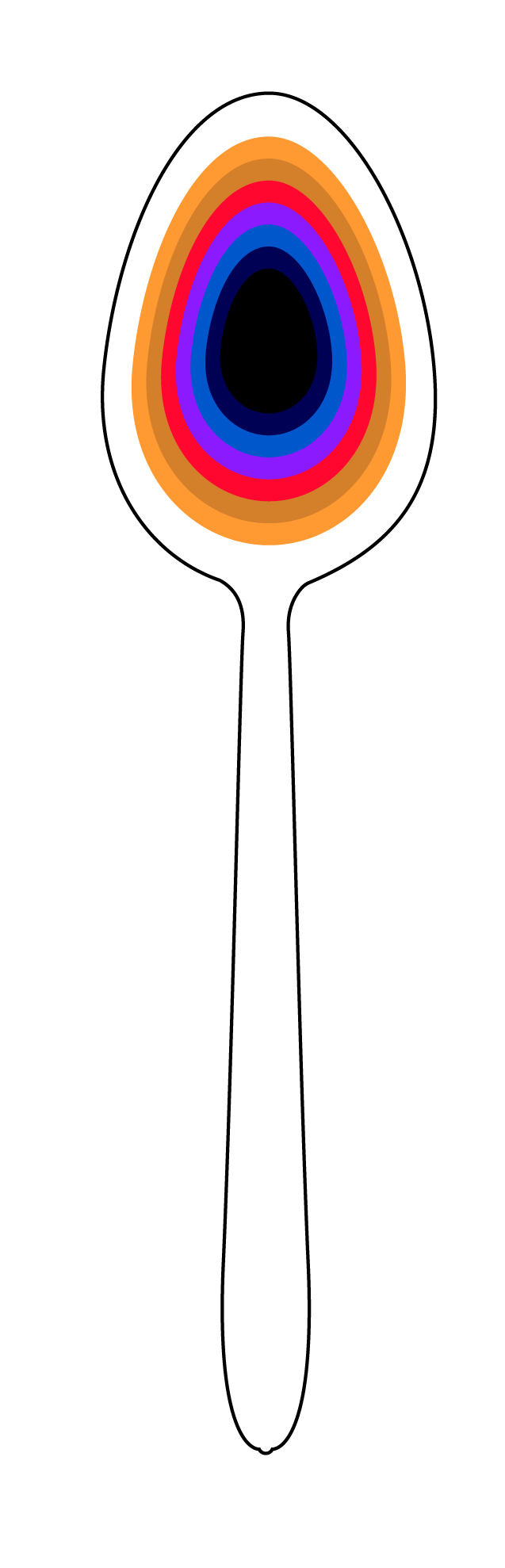
I have here a wonderful movie poster by Aleš Najbrt from 1999 – that was when we saw it for the first time and since then I know that it is a perfect didactic example. It is also beautifully puristically simple. From a graphic-didactic creative point of view, it is a darling and a rare piece, because the main wow principle is so universal!

GRAPHIC ANATOMY – what works so well there?
The graphic designer has put a common object right under our noses – a spoon, but beware! On a completely unexpected scale. This plastic spoon normally measures 10 cm, but here it dominates the entire poster!
+
In this example, we see a surprisingly loose relationship between the main motif of the poster and the key theme of the film.
It is the complete opposite of the effort: to hit the bull's eye with the main motif in terms of meaning!
Interestingly, this loose connection (main attribute + theme) is not a problem at all. On the contrary, it is a nice change, a mental refresher for the audience.
So next time you're wondering about the main prop for your poster, please remember that courage pays off!
Your poster must grab attention in the first second! Please don't worry about the fact that the main motif (in this case, a plastic spoon) is not essential to the plot of the entire movie Pelíšky.
The spoon plays only one small (yet wonderfully comical) episodic role in the film, in one single 3-minute scene. And yet, graphic designer Najbrt boldly turned it (the spoon) into an unmissable and BEAUTIFUL MAIN MOTIVE of the poster. The solution is so clever, bold and elegant at the same time!
In short: When you use a huge object in your graphic and "snap" your viewer right in the eye with this detail ... then no one will ignore you. Everyone will notice you!
OTHER REASONS: why work with a macro object in graphic design?
A macro object can capture attention. It is pure and concrete. It immediately removes the distance between your graphics and the viewer.
A concrete prop is like a fresh juicy morsel, into which the viewer's eye "bites" with relish.
The viewer immediately identifies it (the main prop) - he knows for sure what he is looking at. No treacherous fog of uncertainty. Everything is straightforwardly clear and concrete.
All this will help you in your future graphics. Your graphic communication will work in a flash.
And what is the best thing ever?
This principle with a mega-large prop will work for you in any graphic format:
Presentation on a monitor
Book cover
Flyer
A1 poster
Billboard
Mobile screen
A mega-large detail will do you a great service everywhere.
Want more proof of the same principle? WOW!


Don't forget!
The unexpected scale in the poster works!
Personal memory
I remember how fascinated and captivated I was as a boy by the illustrations in the book Gulliver's Travels. It wasn't until many years later that I realized it! The book illustrator had developed exactly the same principle that we are talking about today - the good old effect of a sudden unexpected change in scale!

YOU CAN DO THIS BIT WITH EASE
The magic of this "macro" principle is that absolutely anyone can apply it.
And it doesn't matter if you are a beginner in graphics or a senior graphic designer.
With graphic greetings Michal Žižka


Comments